

Invisible Cities
The brief from the International Society of Typographic Design (ISTD) was to create a new, large-format edition of Italo Calvino’s Invisible Cities, which brings new meaning to the work.
This project was awarded MISTD from the International Society of Typographic Design.
I created this flag book layout with three strategic aims to achieve:
1: Two narrative structures
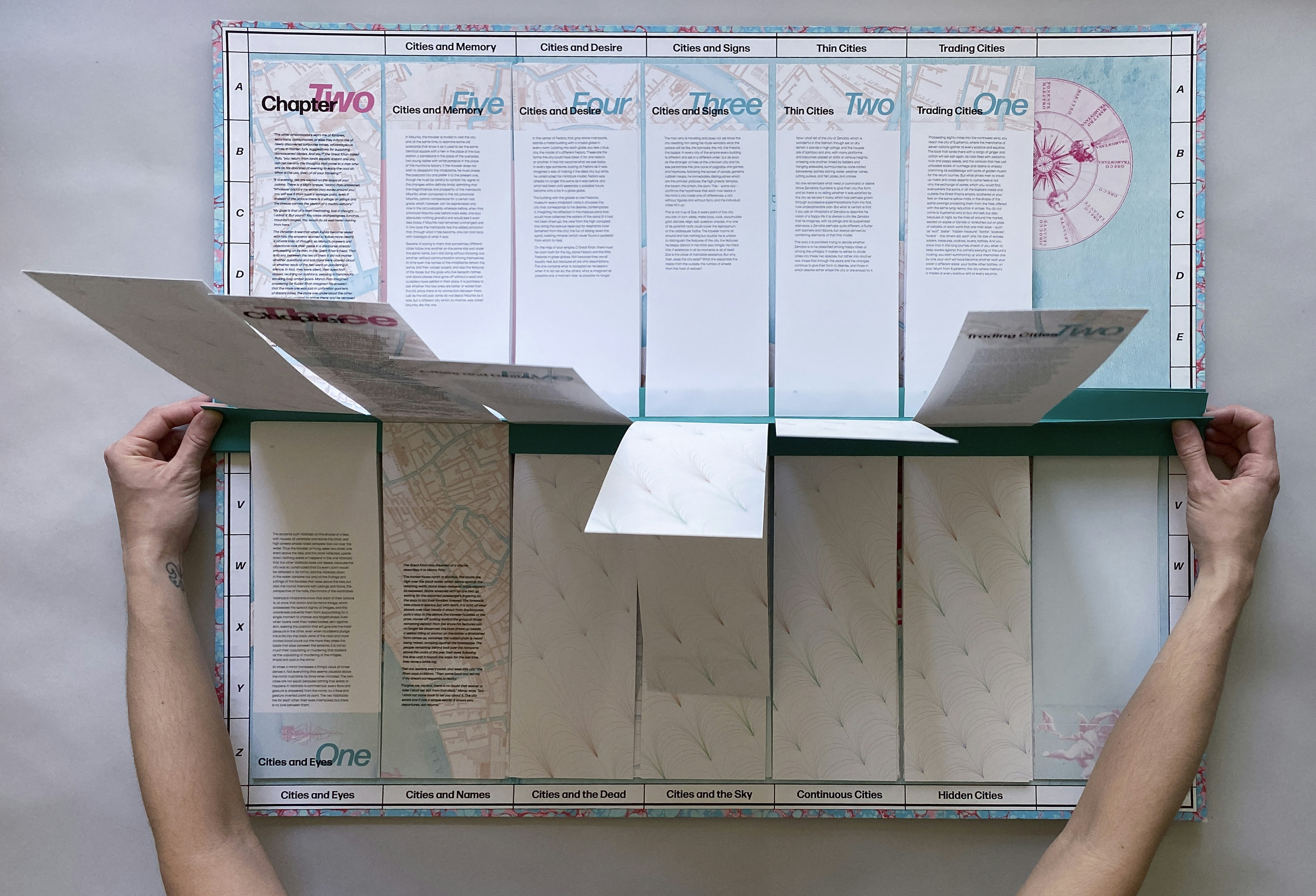
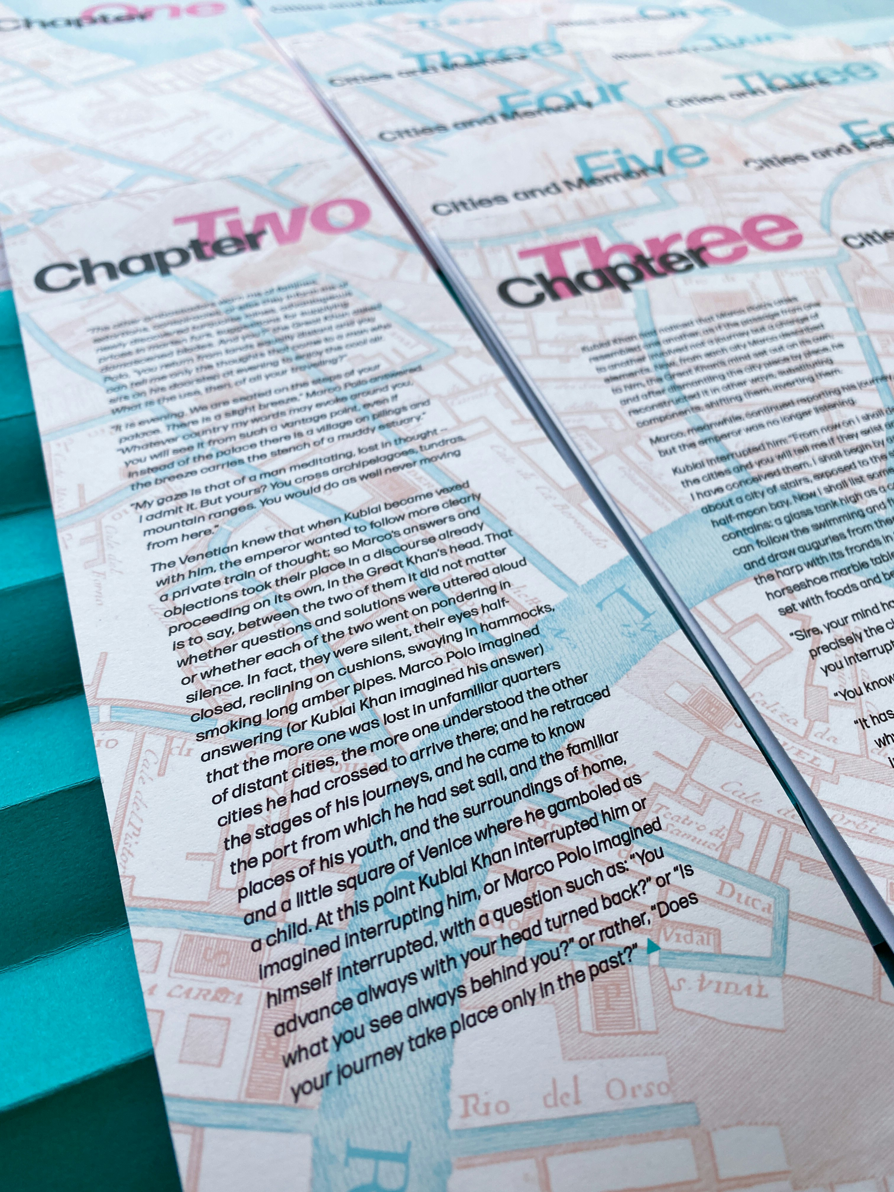
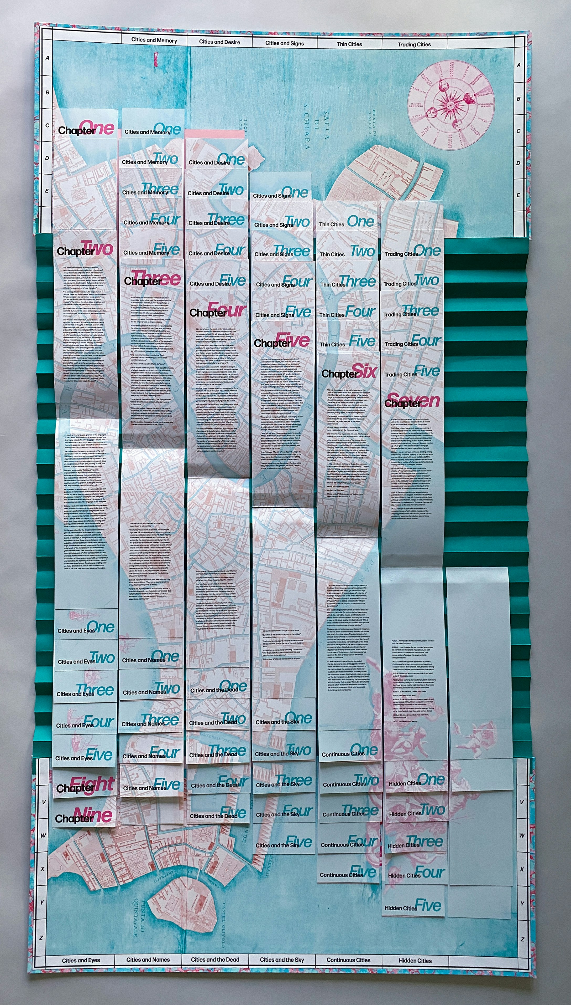
The originally published order has 55 tales divided into nine chapters. Each tale is titled with a theme – “Cities and Memory”, “Cities and Desire” and so on, and these are distributed in a regular pattern throughout the chapters.
By implementing an unusual binding method, I was able to provide the reader with a second narrative order in the same edition.
Cutting across chapter divisions, this allows the book to be read in two, perpendicular directions, and helps the reader access more easily the lessons Marco Polo (or Calvino) is imparting with each theme.
2: Bring visual clarity to the revelation that Marco Polo is describing one city: Venice
A picture of Venice is created, not only through the words on the page, but through the fragments of map that are included with each tale.
When the spine of the book is pulled fully open, the pieces of the map fall into place; a gestalt moment when the whole becomes greater than the sum of the parts.
3: Reveal the three time frames inhabited by this book
The three time frames are the 1200s, when Marco Polo and Kublai Khan lived and when it is purportedly set; the 1970s, when Calvino wrote the book; and now, when the new edition is being created.
In multiple dimensions, this edition reflects and represents the various time frames at play through the use of typography, materials, and imagery.